Formic Brand System
The brand and type guidelines I work from on every piece.
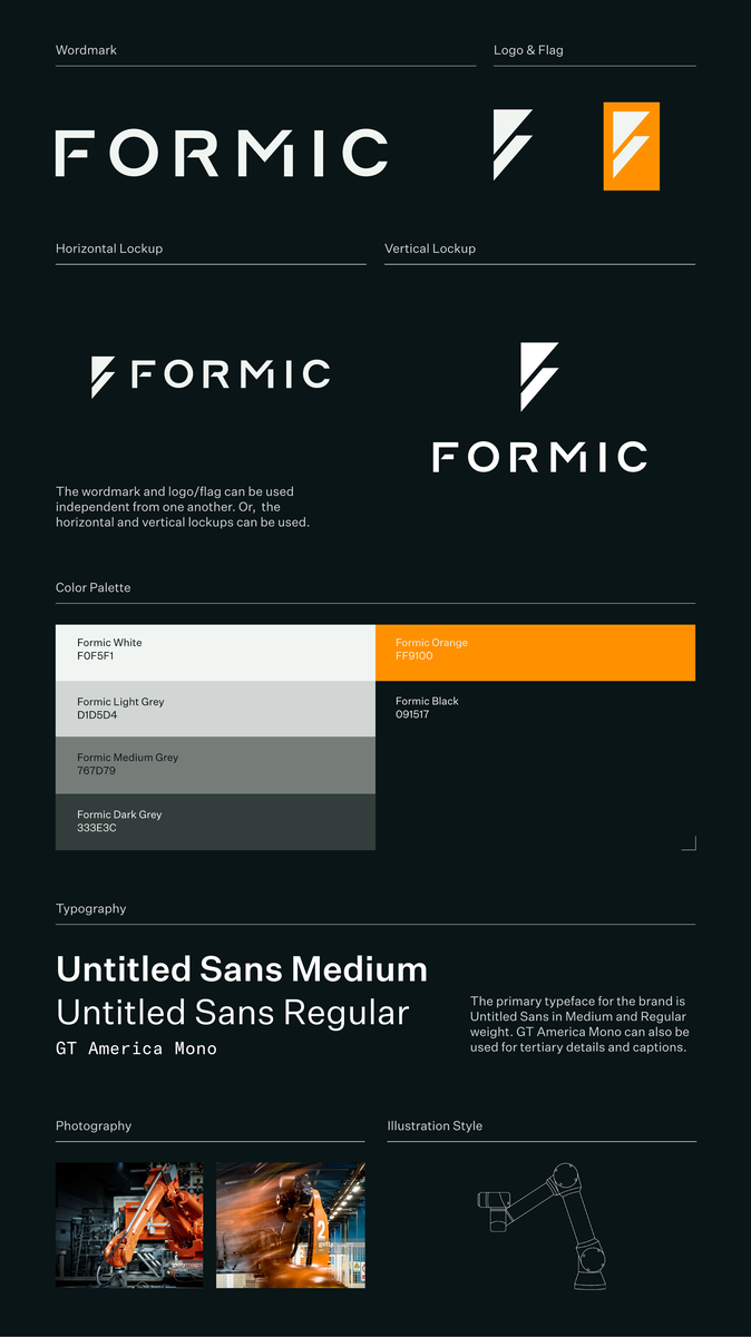
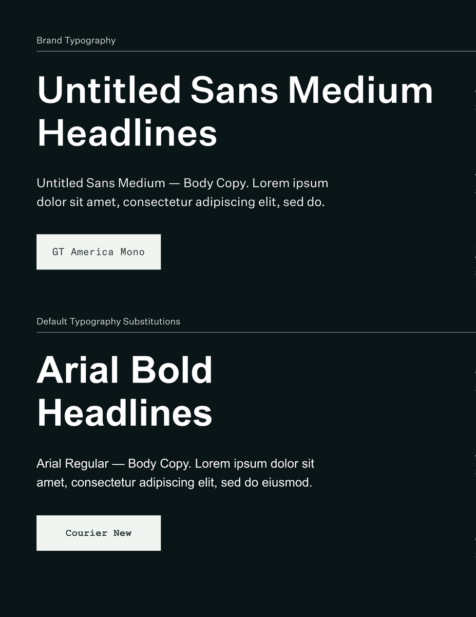
Formic already has a defined identity and type system. They needed new pieces that fit it, not a rebrand.
I work straight from Formic's brand and type guidelines, so each project reads as theirs no matter the format.
Whatever Formic sends my way comes back on-system and ready to use, across print, apparel, and live events.
The brand and type guidelines I work from on every piece.
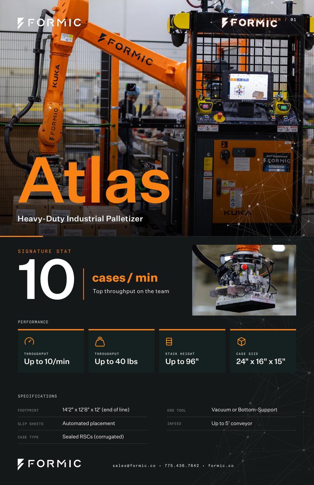
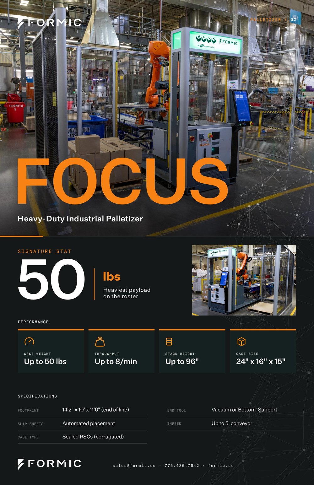
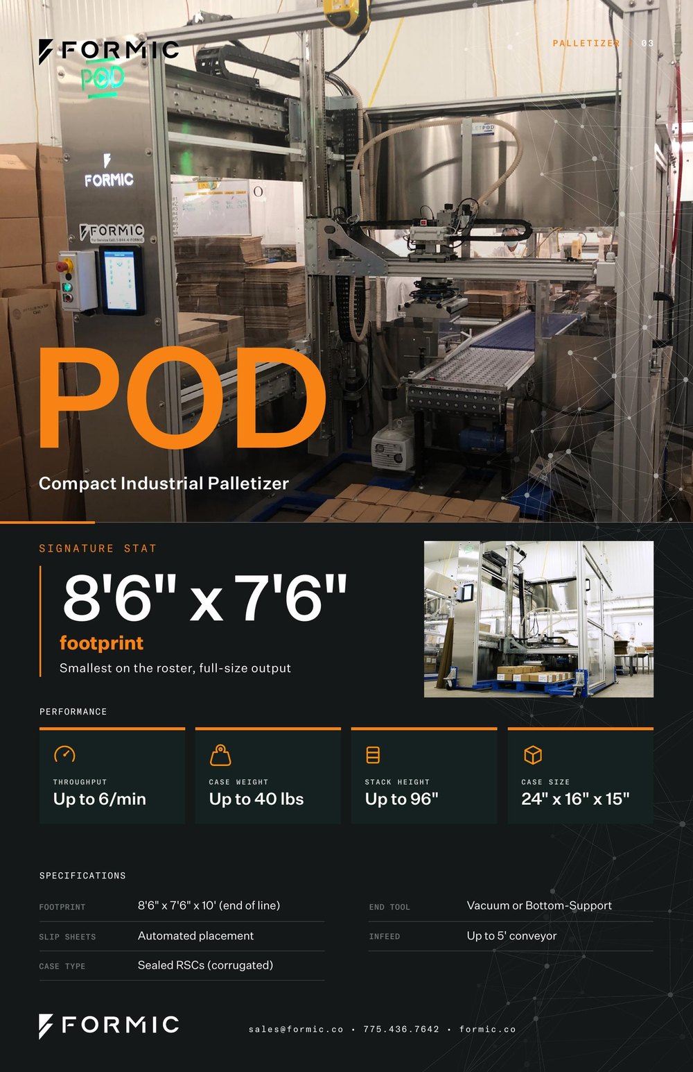
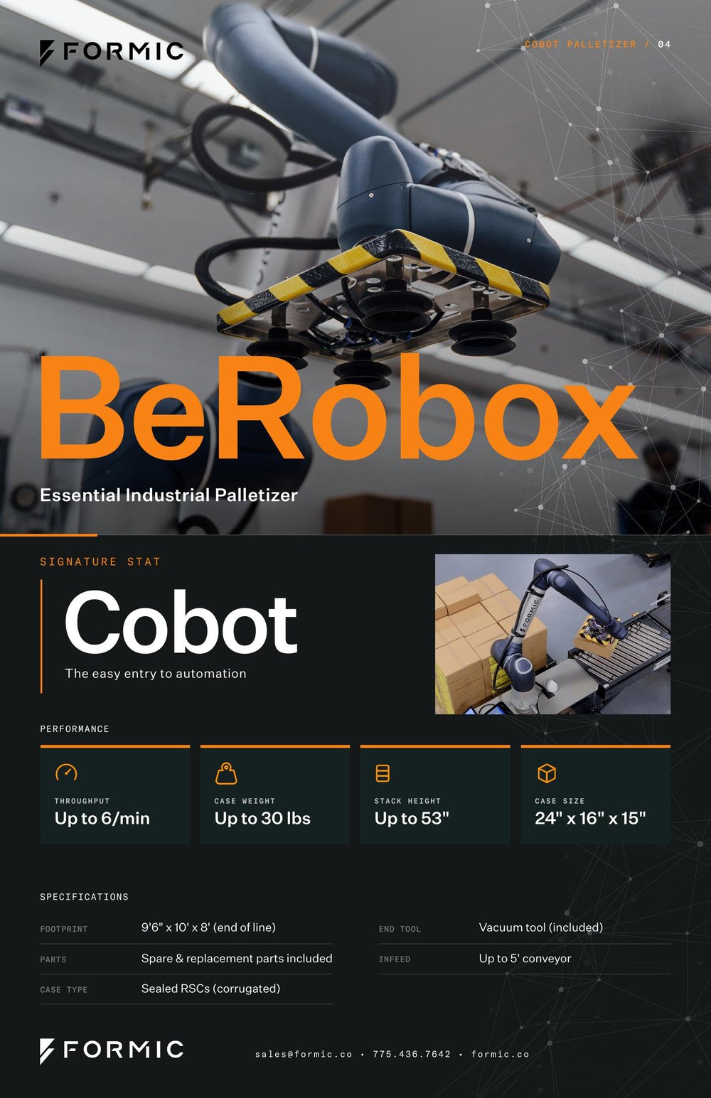
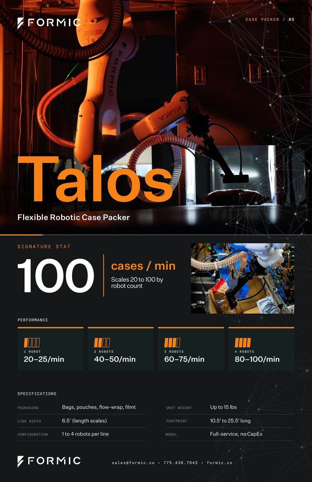
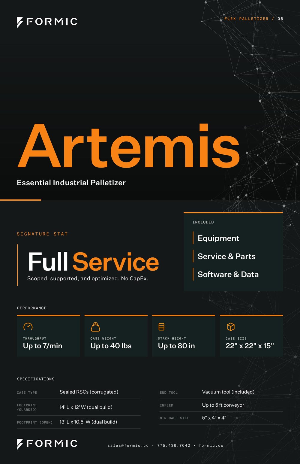
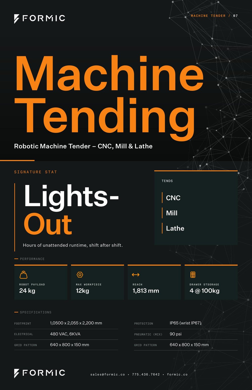
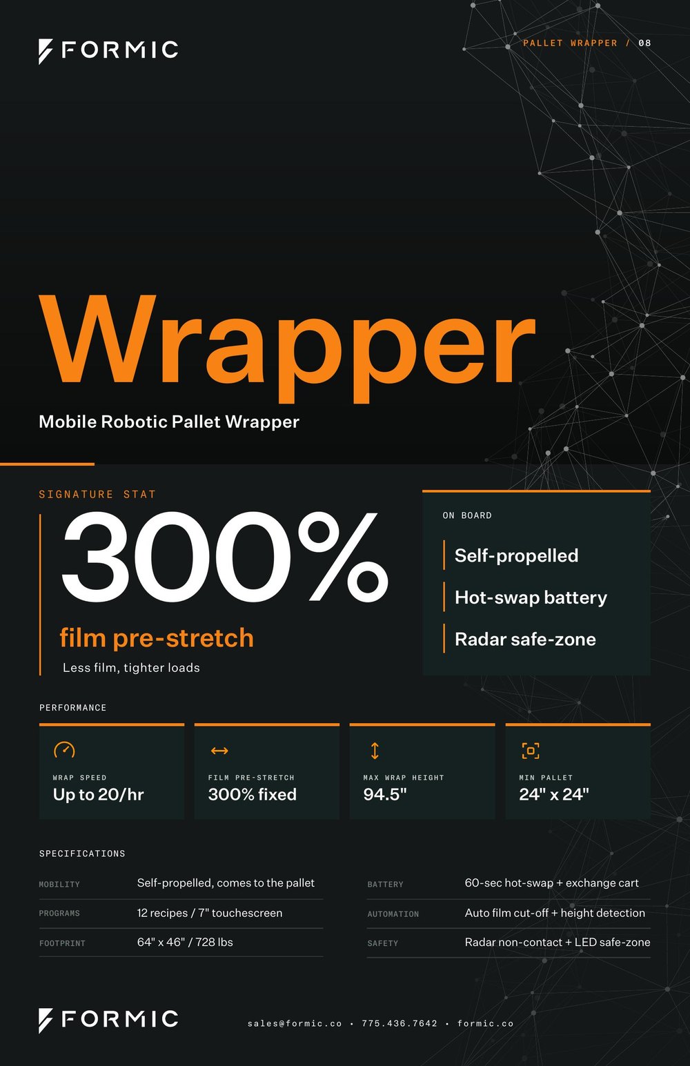
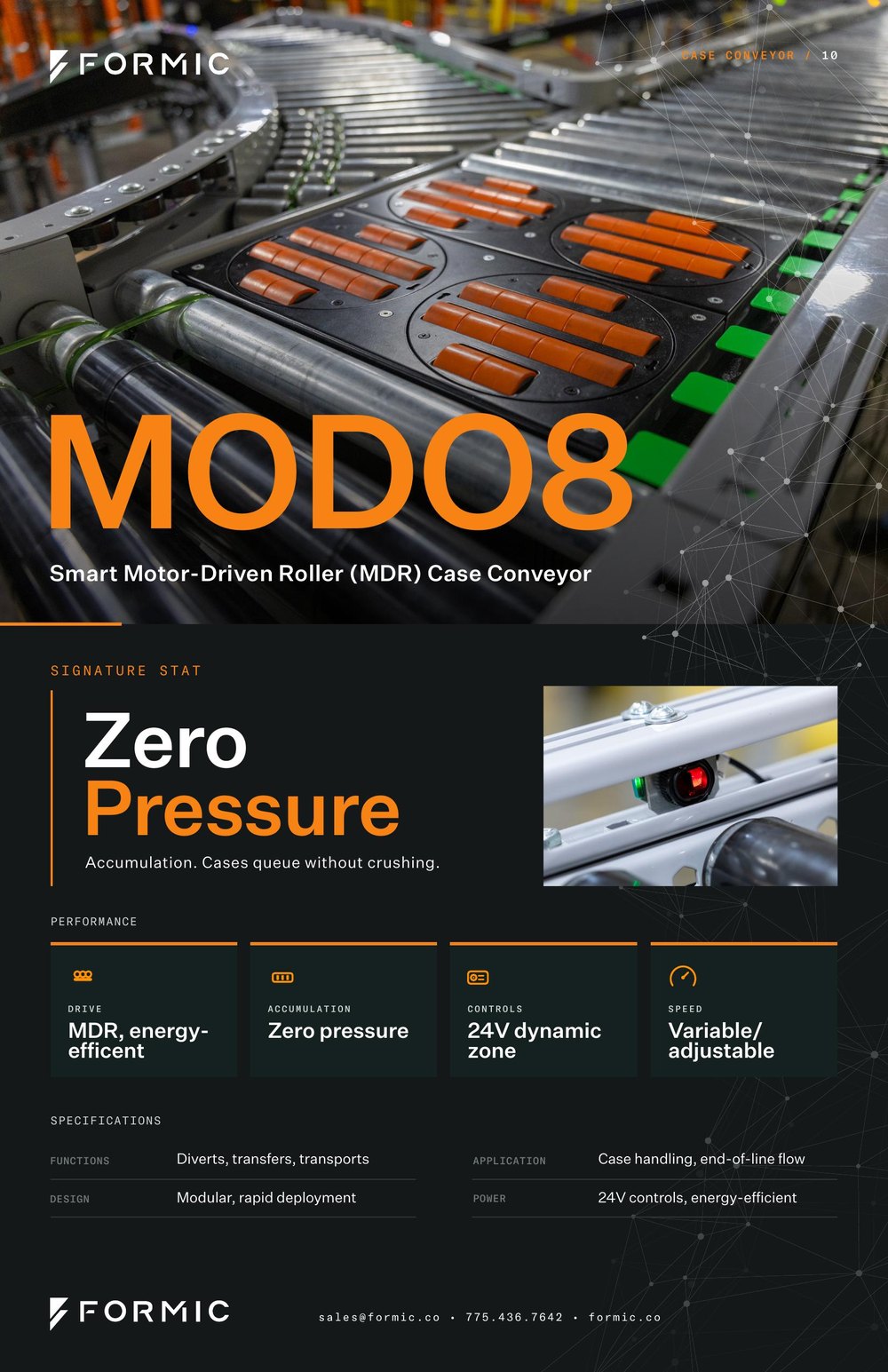
A spec poster for every system on the floor at the Bolingbrook HQ opening, displayed next to its robot during the live demos.
Six ran on product photography. For the three without a usable shot, Artemis, Machine Tending, and Wrapper, I built type-led versions on the same grid so they sit right next to the photographed ones.
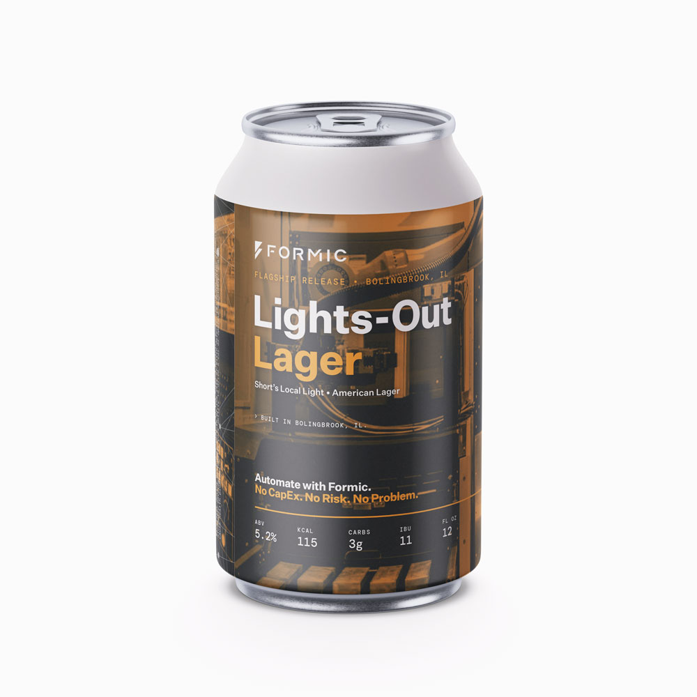
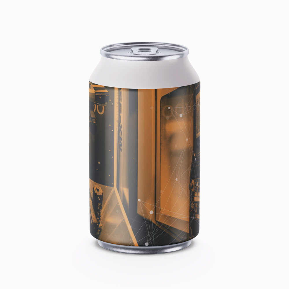
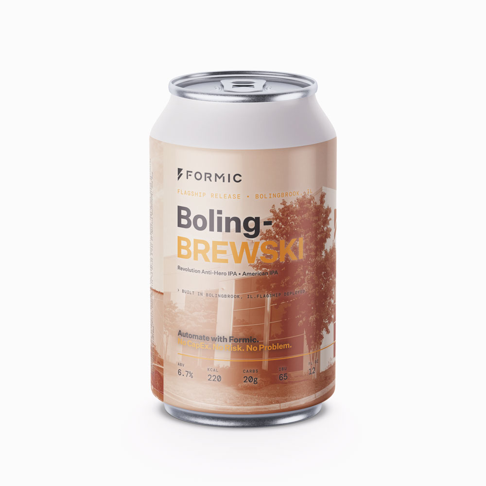
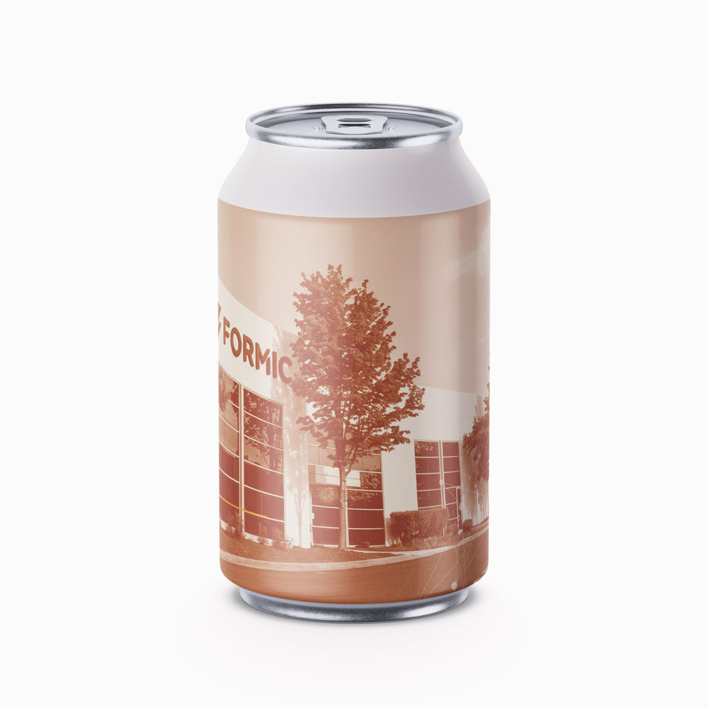
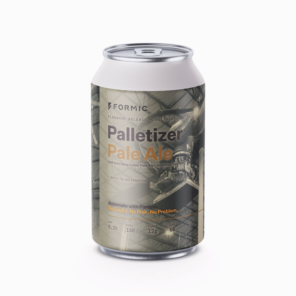
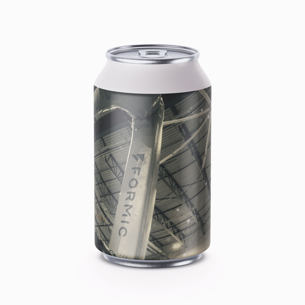
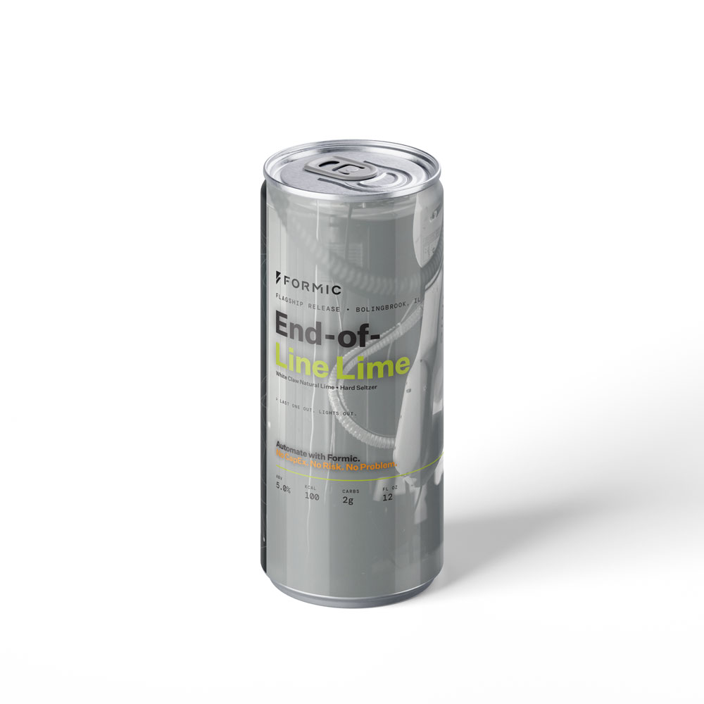
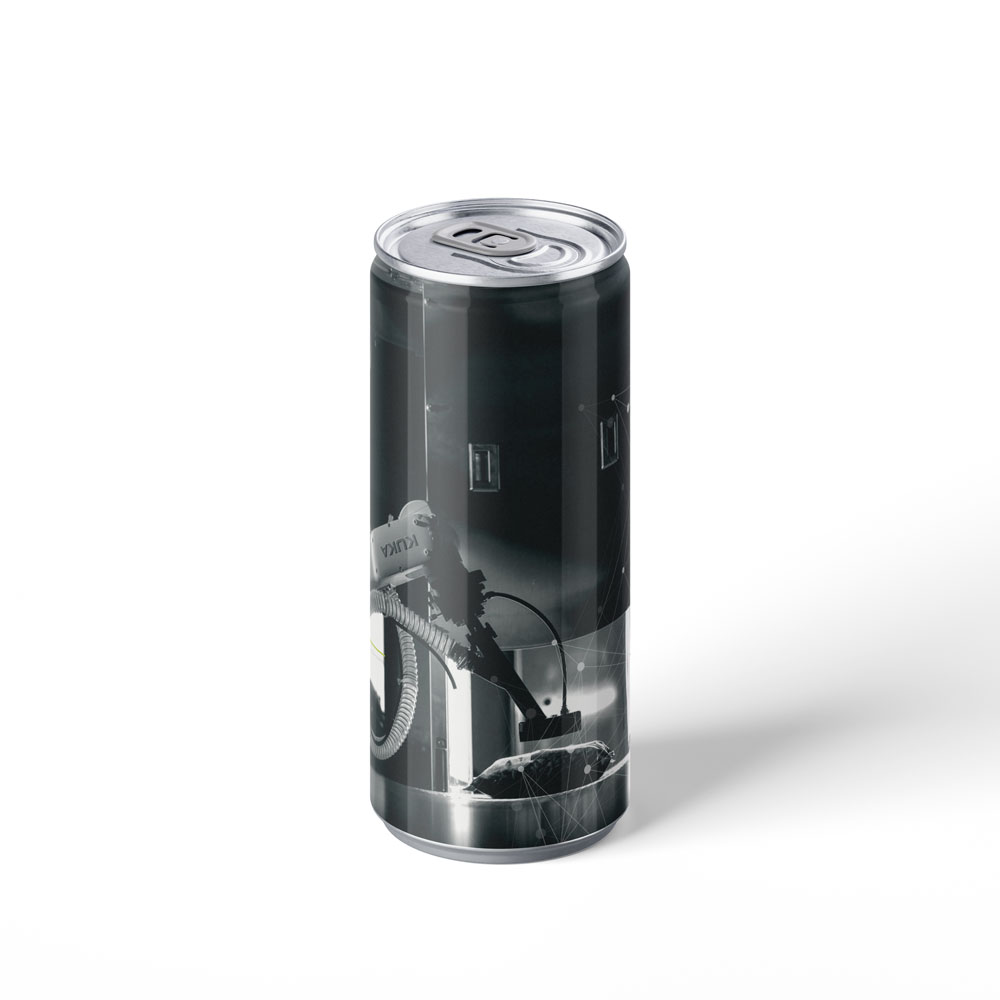
Slap-on labels for the private opening night, wrapped over well-known beers so the bar poured "Formic" cans all evening. Each name ties a local brew to a robot or the new Bolingbrook facility, run through the same brand kit as the rest of the work.
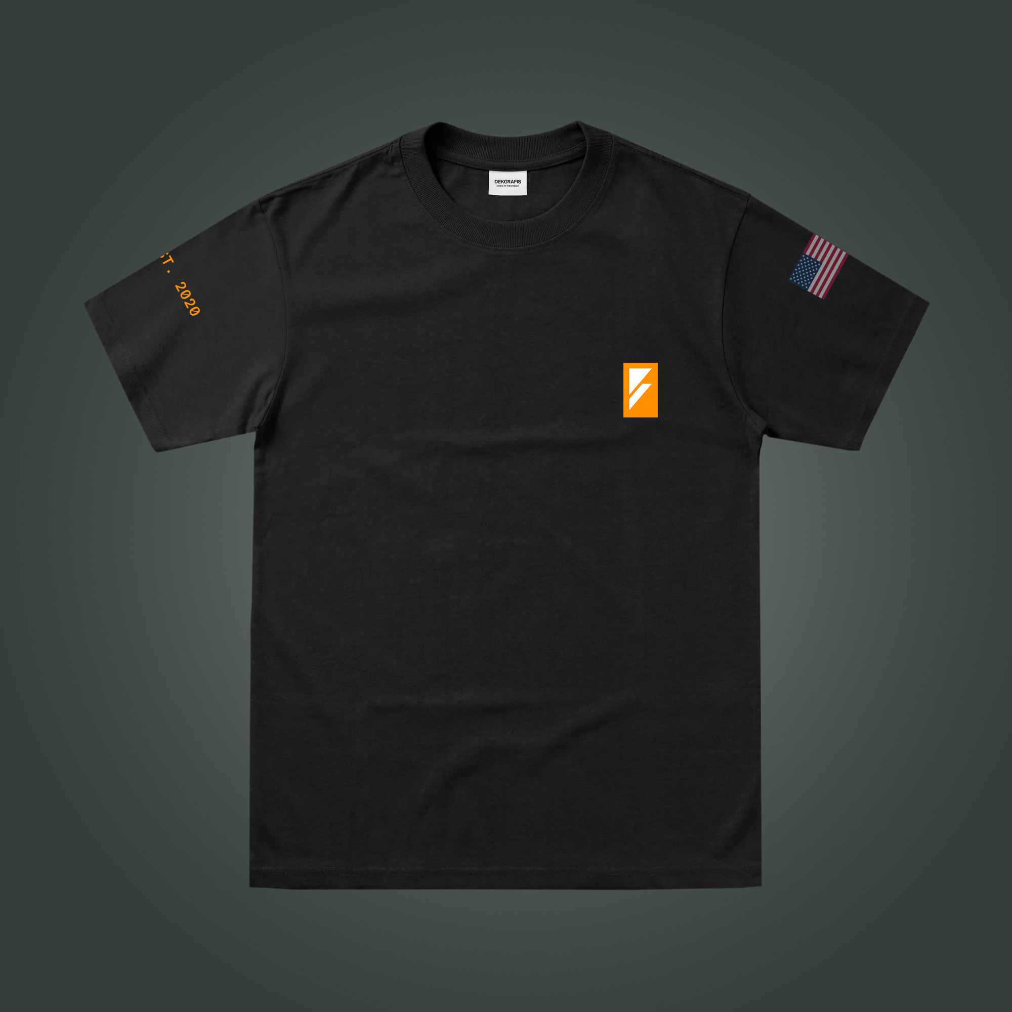
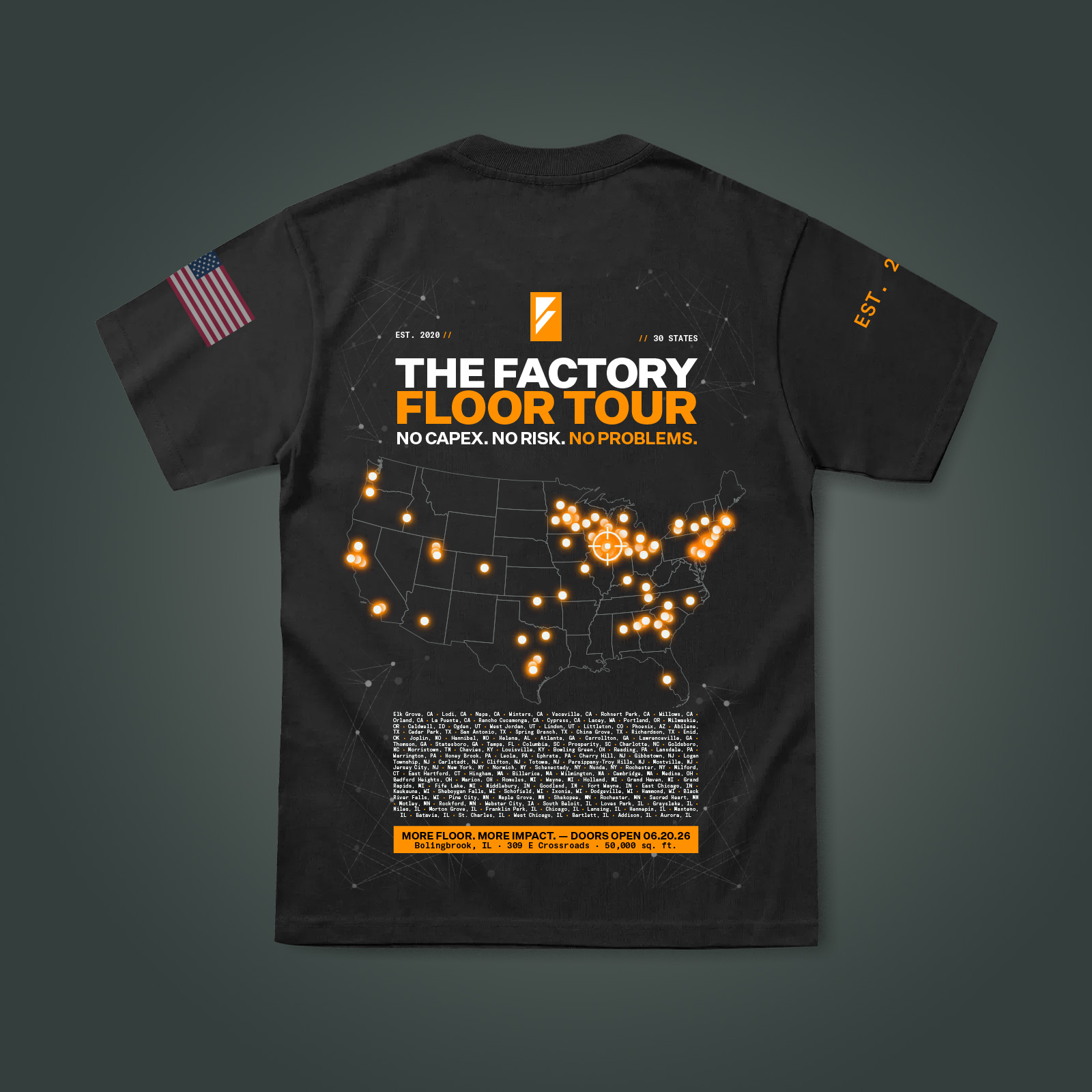
A tour-style shirt for the Bolingbrook HQ opening. Six years of installs laid out like a band's tour back, pulled from the same brand kit.
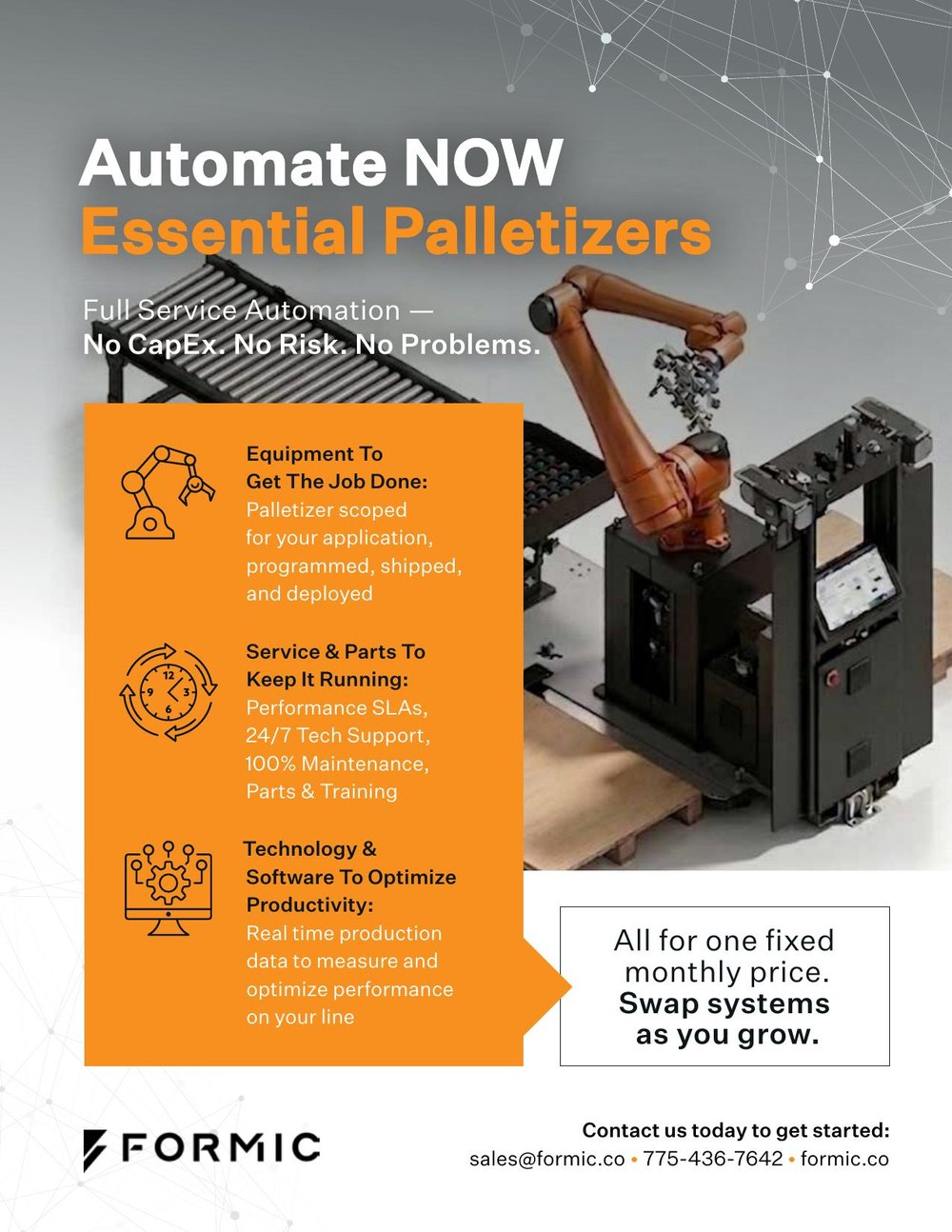
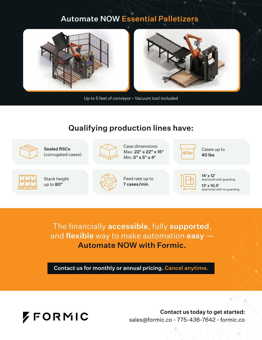
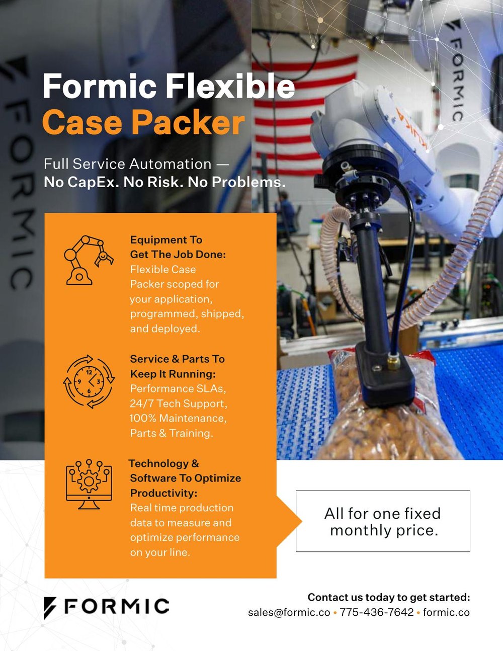
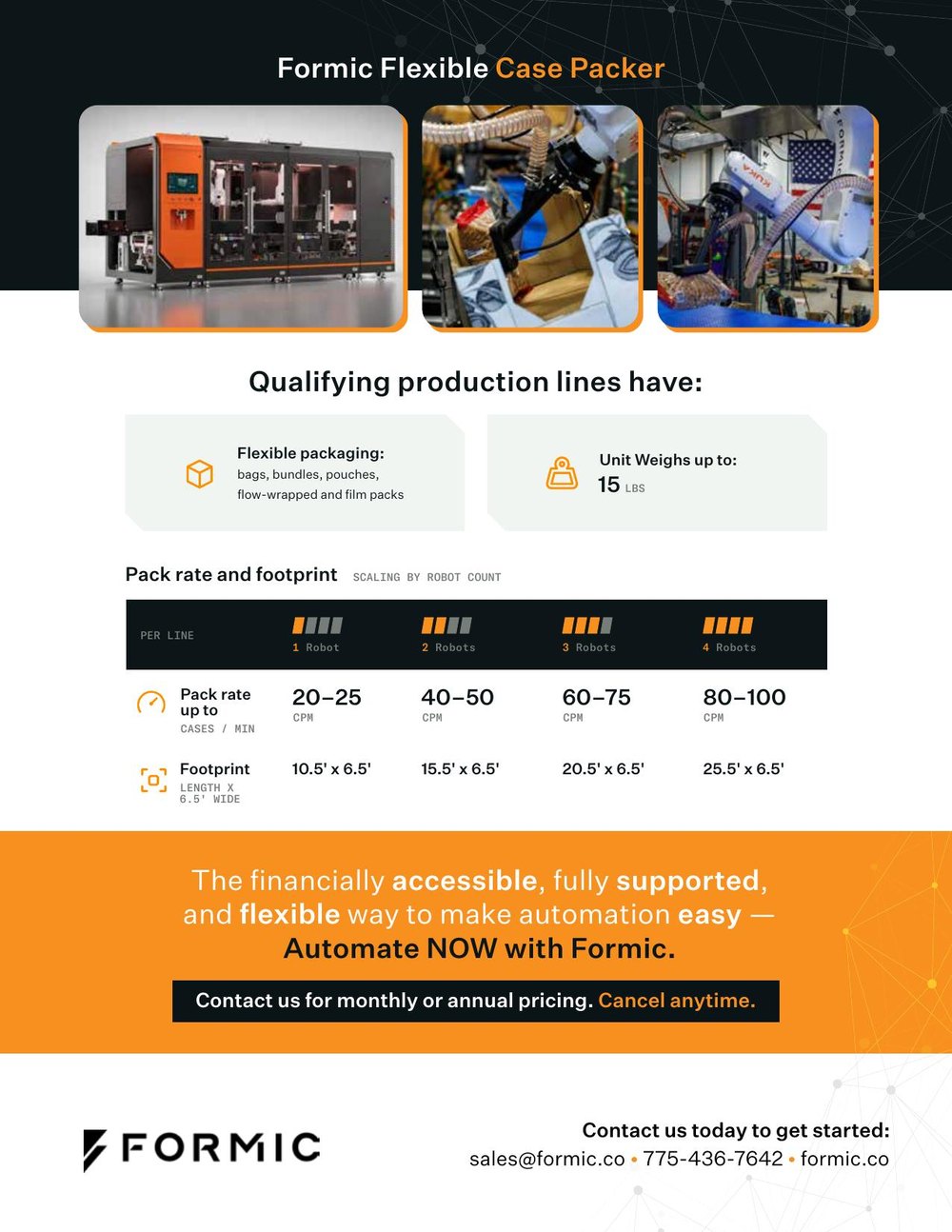
The day-to-day work. Formic sends the product specs and I build the sheet inside their system: comparison charts, single-product cut sheets, the handouts sales brings to calls and trade shows. A few of the recent ones.